Skip to Main Content
Line Charts in Excel
 A line chart like the one to the right is useful for showing trends over time. We can make these charts in Excel.
Download and open this Excel file of World Development Indicators data to get started. You'll notice that in Excel, the GDP cells have little green triangles in the corners. This indicates the number values here are stored as if they are text. To fix this, click in the upper left cell of the values and highlight all of them. Then, click on the little yellow exclamation point and select "Convert to number."
 Next select all the data. (Click in cell A1 and drag across to the last value on the right for Venezuela.)
Now we can create a chart. In the Insert menu, click on the Insert Line Chart button in the middle of the menu. Then, select the first option under "2-D Line Chart."- Some elements that you can (and should) change are the "Chart Title" and the axes title. Click on "Chart Title" to enter something more informative (see example above). To add an axis title on the right hand side, in the Design menu click on the "Add Chart Elements" button in the upper left, and select Axis Titles > Primary Vertical. Then click on "Axis Title" box within the chart to label the units (see example above).
Downloading Data from the World Development Indicators
- First go to the website for the World Development Indicators. This is the system for accessing data distributed by the World Bank.
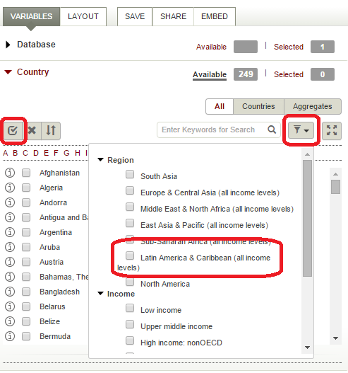
- Next we select the countries to be included. You can check them off one by one, or filter by regions or levels of development then select all. Here we have selected all the Latin American countries.
 The next selection is the series. This is the same thing as a variable--the kind of information that has been collected about your countries. There are many series in WDI, so searching can be helpful. Here we have searched for "GDP" and selected "GDP per capita (constant 2005 US$)."
Remember that you are comparing countries, so you will want to choose series in a unit of measurement that is the same across countries (as opposed to local currency unit, or LCU, which vary widely). Also, if you want to look at a trend, you will want to use a "constant" series that adjusts for inflation. Next we select time, which is fairly self-explanatory. WDI contains annual data only. Here we have selected the most recent 10 years.
 Click on the "Apply Changes" button in the center of the screen to display your data.
 We can change some of the default layout and formatting, and we should. First, click on the "Layout" tab next to "Variables," in the upper left of the screen. We will use the Orientation options to rearrange the way the data are presented. Change the Series to Page and Country to Row, as shown in the image to the right, so that all the countries are shown in one sheet. Click on "Apply Changes" when you are done.
 There are several ways to download, but this time we'll download as formatted. Select "Data On This Page Only - Formatted," then save the file somewhere you can find it again. The file name will be "Data_Extract_FromWorld Development Indicators."
Tabulations using Pivot Tables
 PivotTables are a useful tool in Excel when you have categorical variables. We will use it to make a table of average GDP for groups of countries. First, download and open this spreadsheet to get started.
- This spreadsheet has had scores for 1996 from the Polity IV dataset added; these represent countries on a scale from autocracy (-10) to democracy (10). We will treat these scores as if they are categorical variables. (Notice that we don't have a lot of variation in this variable.) Select columns A through U, then from the Insert menu select PivotTable. Click okay to put the PivotTable on a new sheet.
 We want each row to be a Polity IV score, and a column with the average GDP for all countries with that score. To do this, in the PivotTable Fields box, drag Polity 1996 into the Rows box, and 1996 into the Values box.
- Note that the table now gives us the sum of the GDP of these countries, but we wanted the average. Click on "Sum of 1996" and then select "Value Field Settings" to change this.
 In the Value Field Settings menu, choose to summarize values by Average, then click OK.

 A line chart like the one to the right is useful for showing trends over time. We can make these charts in Excel.
 You'll notice that in Excel, the GDP cells have little green triangles in the corners. This indicates the number values here are stored as if they are text. To fix this, click in the upper left cell of the values and highlight all of them. Then, click on the little yellow exclamation point and select "Convert to number."
 Next select all the data. (Click in cell A1 and drag across to the last value on the right for Venezuela.)
 The next selection is the series. This is the same thing as a variable--the kind of information that has been collected about your countries. There are many series in WDI, so searching can be helpful. Here we have searched for "GDP" and selected "GDP per capita (constant 2005 US$)."
  Next we select time, which is fairly self-explanatory. WDI contains annual data only. Here we have selected the most recent 10 years.
 Click on the "Apply Changes" button in the center of the screen to display your data.
 We can change some of the default layout and formatting, and we should. First, click on the "Layout" tab next to "Variables," in the upper left of the screen. We will use the Orientation options to rearrange the way the data are presented. Change the Series to Page and Country to Row, as shown in the image to the right, so that all the countries are shown in one sheet. Click on "Apply Changes" when you are done.
 There are several ways to download, but this time we'll download as formatted. Select "Data On This Page Only - Formatted," then save the file somewhere you can find it again. The file name will be "Data_Extract_FromWorld Development Indicators."
 PivotTables are a useful tool in Excel when you have categorical variables. We will use it to make a table of average GDP for groups of countries. First, download and open this spreadsheet to get started.
 We want each row to be a Polity IV score, and a column with the average GDP for all countries with that score. To do this, in the PivotTable Fields box, drag Polity 1996 into the Rows box, and 1996 into the Values box.
 In the Value Field Settings menu, choose to summarize values by Average, then click OK.