
 Excel files have file extensions of .xls or xlsx, and are very common ways to store and exchange data. To open these files in SPSS, go to File > Open, and select Data from the drop-down menu. Under Files of Type, change it from "SPSS Statistics (*.sav)" to "Excel (*.xls, *xlsx, *.xlsm)," then choose your file in whatever folder it has been saved. Click Open, and you will get one more menu.
Because Excel files can have multiple worksheets within each file, select the worksheet you want, and make sure the box is checked next to "Read variable names from first row of data."
Click OK and your file will load; check to make sure it looks as you expected.
 Text data files have file extensions like .txt, .csv, or .tsv, and are very common ways to store data. To load these data, go to File > Open, and select Data from the drop-down menu. Under Files of Type, change "SPSS Statistics (*.sav)" to the appropriate file extension (CSV or Text) then choose your file in whatever folder it has been saved.
 Under "How are your variables arranged?" select Delimited. Under "Are variable names included at the top of your file?" select Yes if the file has a row of column names. Then click on Next.
 If your file had column names for the first row, then the first case of data begins on line number 2. For most data files, each line will contain values for one case, or observation, so under "How are your cases represented select "Each line represents a case." Under "How many cases do you want to import?" select All of the cases, or sample if necessary, then click Next.
 At this screen, you select the delimiter, which is the character that separates columns. For a CSV file, this is a comma; for a TSV it is a tab. For a TXT file, it could be any of the choices. Make a selection under "Which delimiters appear between variables?" and check the Data Preview to see that it is correct. Some files, commonly CSVs, text values are contained in quotation marks; if this is so select single or double quote under "What is the text qualifier?"; otherwise select None and click on Next.
 The next step is your chance to designate whether a variable is numeric or string (text). The software will guess based on the values, but if it guesses wrong you can click on the variable and select the correct format from the dropdown under "Data format." You can also select "Do not include" if you don't need this variable, and you can change the variable name. Once you've checked the variables, click Next.
 This is the last step. If you want to import these data again, you can save the defined format to go through these steps automatically. Otherwise, click on Finish.
Your data are loaded and ready to analyze.
Sometimes you don't have the data itself, but a frequency table derived from the data. You can enter this by hand using frequency weights. This works when you have one or more categorical variables. Let's start with an example with one categorical variable, for example:
| Value | Frequency |
|---|---|
| Ran | 8 |
| Did not run | 18 |
In this example, you have one dichotomous variable (whether a subject ran or did not run in an experiment), and the Frequency column indicates how many cases fell in either of this categories. To enter this as a weighted table, first we need to create a new dataset. Open a new dataset from File > New > Data.
At the bottom of the Data Editor Window, click on Variable View to create new variables. In this example, you'll want two variables: Ran (with values of 1 or 0, for ran or did not run) and Frequency, with values from the frequency column above. Enter the names of the variables in the Name column, leave the type as Numeric, and change the Decimals column to zero, because all the values will be integers. (The Width and Decimals columns shown here control what kind of number can be stored in the variable; Decimals refers to how many places there are to the right of the decimal point, while Width is total number of places.)

 Switch back to Data View (bottom of the screen) to enter the data. In the Ran column, enter 0 and 1 on two lines, for ran and did not run, then in the Frequency column enter the corresponding values from the frequency table at the beginning of the example. These values represent how many people ran or did not run in the experiment.
 In order to make this work as a frequency table, go to Data > Weight Cases. Choose "Weight Cases By" and move frequency into the frequency variable field, then click OK. Now you can do analyses like binomical test or chi-square goodness of fit.
You can create weighted tables for tests using more than one categorical variable, also. In the example below, we have two categorical variables presented in a contingency table.
| Ulcers | Thalidomide | Placebo |
|---|---|---|
| Ulcers healed | 14 | 1 |
| Ulcers did not heal | 9 | 21 |
Open a new dataset from File > New > Data. At the bottom of the screen, click on Variable View to create new variables. In this example, you'll want three variables: thalidomide (0 or 1 for yes or no), healed (0 or 1), and frequency (numeric). Enter these three on three separate lines under Name. Under Type, leave them all as Numeric. You can change any field by clicking on it.

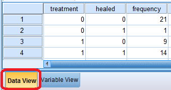 Switch back to Data View (bottom of the screen) to enter the data. The values for thalidomide and healed will be combinations of 1 or 0 (for yes or no), while frequency will contain the numbers corresponding to the table above. There will be four rows.
 In order to make this work as a frequency table, go to Data > Weight Cases. Choose "Weight Cases By" and move frequency into the frequency variable field, then click OK.
Now you can use Analyze > Descriptive Statistics > Crosstabs... to analyze these data, for example. These kinds of tables will also work for other non-parametric statistics like the binomial test, but in that case you would have only one dichotomous variable instead of two.
New variables can be created in the Variable View of the Data Editor Window. The Variable View can be toggled with the tab in the lower left hand corner of the Data Editor window.

This window lets you enter information about variables, which can be important for how data work in tests, and how data are displayed. All of the following fields can be changed by clicking in the field and typing in a new selection. Pay attention to the following fields:
 Sometimes a categorical variable is stored as a string (or text) variable, but a test requires a numeric variable. The easiest way to fix this is to create a new variable with Automatic Recode that will convert the variable to numeric with labels containing the old string values.
Go to Transform > Automatic Recode.
 Move the string variable over into the Variable > New Variable list. In the field next to New Name, enter a variable name different from the original variable, then click Add New Name. (In the case illustrated, the RC in the new variable name indicates a recode.) Then click on OK, and a new variable will be created.
 Go to Transform > Compute Variable...
This menu allows you to create new variables based on existing variables. In the Target Variable field in the upper left, type in the name of the variable you want to create. Then, on the right-hand side of the menu, select the transformation you want to perform. Most of what you'll need is in the Arithmetic group, so first click on Arithmetic in the Function Group list, and then select the required transformation from Functions and Special Variables; for example, if you want to take the log of an existing variable, double-click on Lg10.
You will see "LG10(?)" entered into the the Numeric Expression box. To replace that question mark with the variable you need to the log of, select the appropriate variable from the list on the left and click on the arrow to move it into the expression. When the expression is complete, click on OK and your new variable will be created.
Other transformations can be computed in the same way; select Ln for natural log, Arsin for arcsine, or Sqrt for the square root. Exp will give you e raised to the power of whatever number or variable you enter.
 This is something you might want to do if, for example, you have two categorical variables and would like to create boxplots for each possible combination of the values of those variables. Following these instructions will create a new variable containing those combinations. In this example, we have two categorical variables, WaterAvail and NutrientAvail, that each have values of 1 or 3. First, go to Transform > Compute Variable. In the Target Variable field, enter the name of the new variable that you want to create. In the Numeric Expression field, enter the following equation: CONCAT(string(NutrientAvail,f1),string(WaterAvail,f1)). The string function converts the values of NutrientAvail and WaterAvail to text rather than numbers. The second argument in the function, f1, formats the number so that is an integer, without decimal points, before converting it to a string. The CONCAT function pastes the two values one after the other.
  Once the expression is entered, click on Type & Label under the Target Variable field. The CONCAT function creates a string variable, so you will want to set the type as String. Otherwise, the variable will not be created. Click continue.
 Click OK, then check to see that the new variable has been created. You should see a new column in the Data View, will values of 11, 13, 31, 33.
 The variable has been created, so you can create boxplots or whatever you'd like. However, you will probably want to make labels for the values that represent what they mean. To do this, change to the Data View, and in the last row, click on the cell under Values to create value labels.
 At this point you will want to be familiar with the values of the variable you have created. For each possible value, enter the value in the Value field, and then in Label field, enter a very short description. For example, for the value 11, enter n=1&w=1. This label will display when you make a chart. Click on Add, then keep adding labels for every possible value of your variable.
The Explore menu can create histograms and Q-Q plots for assessing whether your data are normally distributed, as well as a number of descriptive statistics. Go to Analyze > Descriptive Statistics > Explore to begin.
 Move the variable you want to check in to the Dependent List box. Then, click on the Plots... button in the upper right to select the kind of plot you would like to output. If you want to check multiple variables at the same time, you can move other variables into the Dependent List box.
 A histogram will show you the shape of the distribution, so check that box. For Q-Q plots, another way to assess the normality of the data, check the box next to Normality plots with tests. Then click Continue, and OK.
 If you would like to check normality within each of the categories of a nominal explanatory variable, you can do that by first moving the nominal variable into the Factor List on the Explore menu, and then move on to the Plots... button.
 A frequency table will show you all the values for a particular variable, and the frequency in which they are present. It is appropriate for a categorical variable, whether it is stored as a numeric-type or string-type. To create the table, go to Analyze > Descriptive Statistics > Frequencies... In the Frequencies menu, move the desired variable into the Variable(s) list, then click OK.
To create a boxplot, you will need a continuous numeric variable; it is typically used also with a categorical variable that divides your data into groups. It is also available through the Explore menu. Go to Analyze > Descriptive Statistics > Explore to begin.
 Move your continuous variable into the Dependent List box, and your categorical variable into the Factor List box. The factors are the variables that indicate which group an observation belongs in. If you only want the boxplots and no statistics, you can select the radio button next to Plots, under Display. click on the Plots... button in the upper right to select the desired plot.
 In the Explore Plots menu, under Boxplots click on the button next to Factor levels together if you want to compare the distributions in different groups. This part only matters if you have selected multiple variables for the Dependent List. If you only want the boxplot and no other plots, see that the other boxes are unchecked, then click Continue and OK to generate your plot.
 You can get summary statistics for variables by going to Analyze > Descriptive Statistics > Descriptives, and selecting variable. If, however, you would like summary statistics according to group membership, first you will need to click on Data > Split File. There, you can move the variable that identifies which group an observation belongs to by clicking on the button next to "Compare groups," then moving that grouping variable into the Groups Based On list. For example, if you want summary statistics according to gender, move a variable identifying gender into Groups Based On. Click OK, then proceed with Analyze > Descriptive Statistics > Descriptives, and your summary statistics will appear in the output according to your groups.
Note that the file will remain split until you turn it off, by going back to Data > Split File and clicking on "Analyze all cases, do not create groups."
 Open the dataset for your regression, and go to Graphs > Regression Variable Plots. Move the Y (dependent) variable into the Vertical Axis Variables list, and the X (independent) variable in the Horizontal Axis Variables list. This will create a scatter plot of the two variables.
 Click on the Options button to create your fit line. Uncheck the box next to "Bordered boxplots for scatterplots if one per row," then under Scatterplot Fit lLines, check the box next to Linear. Then click on Continue, then OK.
 This will create a plot in the Output window like so.
 You have a number of options here, but in this case, for linear regression click on the boxes next to "Standardized," under both Predicted Values and Residuals, then click on Continue. Then run the regression. You can do the same with the general linear model, but for predicted values, use the unstandarized option.
 Now when you go to the Data View in the Data Editor window, you will see new variables, ZPR_1 (standardized predicted values), and ZRE_1 (standardized residuals).
 To make a scatterplot with these new variables, go to Graphs > Regression Variable Plots. Move the Standardized Residuals under Vertical-Axis Variables and move the Standardized Predicted Values under Horizontal-Axis Variables. Then click on OK.
 In the Output window, you will find a graph that looks like this.
